April 24, 2010
Website

The Assassin and the Whiner #12
The thing about reading this comic is that Carrie doesn’t pull any punches at all. I was reading things that felt like they should only be told to her closest friends, and it’s incredibly brave to put everything out there for the world (or at least the tiny part of it that reads comics) to see. In this issue she sinks much deeper into depression over the breakup with her girlfriend and starts drinking again. People who have read this book for a while know that she fought a long battle with alcoholism, so this is a pretty sad step back. It’s weird reading this, knowing that it’s 3 years old. I’ve said it before, sure, but if and when one of these jobs comes through I’m going to send her some money and check out her latest comics. Assuming that she still has some copies around, this should come as a revelation to anybody who’s ever been in a breakup that happened because the connection just wasn’t there for both people.

 Comments Off on McNinch, Carrie – The Assassin and the Whiner #12 |
  Reviews | Tagged: Carrie McNinch, The Assassin and the Whiner |
  Permalink
 Posted by Kevin
April 24, 2010
Website
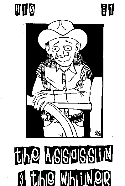
The Assassin and the Whiner #10
One of the first things I noticed upon opening this mini was all the solid blacks, and I’m a big fan of the solid blacks. And the occasional page with tiny panels, which always looks even smaller in the mini format. That’s not necessarily a good or a bad thing; it depends entirely on what’s being said (and how legible it is as some people have a real problem with that). It does feed into my misguided notion of getting more story on the page though. As for the comic itself, well, I loved it. It’s all auto-bio stuff and, when it’s done well, that’s pretty much my favorite kind of comic. This is done really well. This issue is all about moving out to Maryland to live with her girlfriend and the changes that she has to make. She’d never walked around in snow before this! There’s just a wonderful sense of playfulness and joy that permeates this book. She has a deal at the back of the book where you could buy #1-9 for only $6 (or $1 per issue) and I’d say get the whole bunch of them if you still can. This was put out a couple of years ago though so you might want to e-mail her and check to see what she still has available.
Comments Off on McNinch, Carrie – The Assassin and the Whiner #10 | Reviews | Tagged: Carrie McNinch, The Assassin and the Whiner | Permalink
Posted by Kevin
April 24, 2010
Website

You Don’t Get There From Here Goes Goes To Oaxaca
As someone who doesn’t get to travel nearly as much as I’d like, I love these diary/travel comics. It’s a great chance to learn about odd places from people who share a lot of my sensibilities, meaning that if I ever do manage to make it out of this stupid country I’d have some solid ideas on what to do. In this issue Carrie visits some friends in Oaxaca, explores the city in great detail, and even runs into Peter Kuper, as he apparently lives in the area. Along the way Carrie samples some of the best chocolates in the world, discovers that Doritos made outside this country are significantly more edible than the stuff we have here, gets a horrible stomach flu bug, sees all kinds of local art, samples all kinds of local cuisines (although can’t bring herself to eat insects), and just generally does a thorough job of exploring the area. It’s impossible to review books like this and do them any justice; if you’re remotely interested in the area covered or in the artist involved you’re likely to be curious enough to check them out on your own. For whatever it’s worth Carrie has been a favorite of mine for years, so I’m predisposed to like her stuff. Still, it’s an excellent, informative issue, and it’s even light on the introspective side that seems to bug some people who hate auto-bio stuff. Check it out, then go visit the place and see if this was helpful. $2

Comments Off on McNinch, Carrie – You Don’t Get There From Here Goes to Oaxaca | Reviews | Tagged: Carrie McNinch, Oaxaca, You Don't Get There From Here | Permalink
Posted by Kevin
April 24, 2010
Website
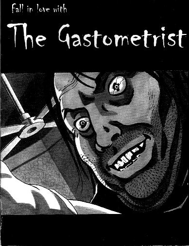
The Gastometrist
Anybody out there like those old cheesy Tales From the Crypt comics? I think you can tell from the cover that this is in the same vein. It’s hard not to give anything away for an eight page comic, but the meaning of the title is also kind of the punchline to the book, so I’m going to have to work around it. Most of what we see in here is a couple of guys talking at a bar, with horrific images coming up whenever the main guy talks about past “jobs”. It’s creepy and short; Tony does a terrific job of mimicking that EC comics feel with the artwork. Worth a look, probably around $2. Contact info is up there, as there’s nothing in here at all and that’s what you’re going to have to go with.

Comments Off on McNamara, Jason & Talbert, Tony – The Gastometrist | Reviews | Tagged: Jason McNamara, The Gastometrist, Tony Talbert | Permalink
Posted by Kevin
April 24, 2010
Website
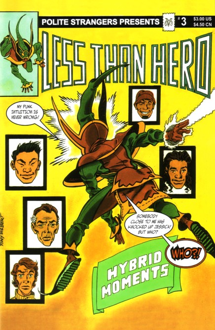
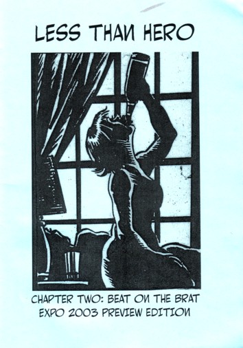
Less Than Hero #3
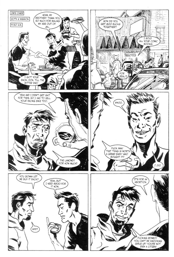
I officially really, really like this book. Even though it’s been months since I read the last issue, all the characters in here are familiar and distinguishable, which is a considerable achievement considering that huge cast of characters. In this one, as you can see from that fantastic cover, The Punk’s girlfriend has been impregnated, and everything else that’s been going on is coming to a head, as #4 is the last issue of the series. They better keep this up with another title, as they’ll be sorely missed if they just quit altogether. There are very few characters more quotable than The Punk, and I think you should find them out for yourselves, as this book has funny or insightful stuff on literally every page. $3, I guess you could wait for the last issue to have the whole story collected in one edition, but the covers are worth the price of admission in my book…
Comments Off on McNamara, Jason & Talbert, Tony – Less Than Hero #3 | Reviews | Tagged: Jason McNamara, Less Than Hero, Tony Talbert | Permalink
Posted by Kevin
April 24, 2010
Website
Less Than Hero #2
This is a preview edition, meaning that any complaints I might have about the art looking awfully scrunched up are useless, as I’m sure it was eventually put into a larger edition. Everything is noticeably starting to come together in this issue. The characters are starting to become incredibly unique, the art looks great (except for the fact that it needs a little room to breathe, but see the first sentence), and the dialogue is phenomenal. All kinds of quotable stuff in here, but I’ll just put up a good sample and let you check it out. I can see why they’d want to rush to get a preview edition out for SPX, as people reading this are much more likely to get hooked on this story than people reading the first issue. This is probably $3 and you’re not likely to find a smarter and more realistic superhero story. I almost hate saying that because I’ve gotten pretty sick of the “real people with super powers!” idea, but I promise that this is worth a look. Come on don’t you trust me?
Comments Off on McNamara, Jason & Talbert, Tony – Less Than Hero #2 | Reviews | Tagged: Jason McNamara, Less Than Hero, Tony Talbert | Permalink
Posted by Kevin
April 24, 2010
Website

Less Than Hero #1
I’m breaking with tradition here and putting the back cover up instead of the front. Why? Well, it’s better than the front cover, frankly, and I thought it would help anybody who’s reading this to refer back to this synopsis to try and figure out what the hell’s going on. This is the first issue of a projected 12-parter, so I’m going to reserve judgment on the storyline. I didn’t get what was going on, but that’s because there are all kinds of characters, they’re all kind of thrown at you without an introduction, and I think they were trying to introduce too much in too small of a time. Still, points for ambition, and it might all come together beautifully. That being said, it’s time to start complaining. I don’t know what it is that some people have against punctuation, but, seriously, use it. Plenty of sentences in here where it just went on and on and it’s not like I can say anything about that but doesn’t it help to have a comma here and there to break up the sentence throw a little inflection into it do you know what I mean? Ahem. Also, for some reason a lot of the “n”s were backwards. Not sure if that was a stylistic thing or just a screw-up, but it stopped me in my tracks and I think that’s a bad thing. All that bitching aside, it wasn’t a bad first issue at all. Tony was obviously influenced by a lot of the great older artists and the book looks incredible, even if I couldn’t tell what exactly the superhero guy looked like until the full page spread. The writing is solid and the dialogue is believable and funny, for the most part. Look, my only major complaint is that they should have taken their time, maybe putting only one character per issue for a while. Sure, that was probably impossible due to finances, but putting out a few minis before this might not have been a bad idea. Anyway, this is $3 and worth a look, although you might want to wait a few issues to you can have a fair shake at figuring out what’s going on. Send them an e-mail…
Comments Off on McNamara, Jason & Talbert, Tony – Less Than Hero #1 | Reviews | Tagged: Jason McNamara, Less Than Hero, Tony Talbert | Permalink
Posted by Kevin
April 24, 2010
Website
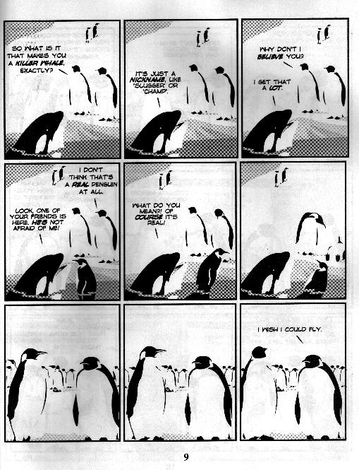
The World is Our Icebox
This is a collection of what looks like three panel newspaper strips about penguins that was shoved into something that vaguely resembled a story. What you get because of that are really dumb punchlines every three panels or so and a very loose cohesiveness to the story, which doesn’t matter that much anyway. It’s all about penguins, so you have wackiness involving their trying to sweet talk a bag, avoiding a killer whale trying to talk them into the water, and trying to fly a paper airplane. Check out the Shellac Jones stuff if you’re really interested in his work, this isn’t a very good representation in my opinion. Unless the other story I saw was the exception and this is the norm, but I don’t like to think like that. Check out the website, there are a few other comics there too. I also found out on the site that this is a collection of strips. Maybe it’s an internet phenomenon or something that I missed, but I really don’t feel like I missed much this time around…
Comments Off on McKinley, Austin – The World is Our Icebox | Reviews | Tagged: Austin McKinley, The World is Our Icebox | Permalink
Posted by Kevin
April 24, 2010
Website

Shellac Jones: River of Love
I’ll waste no time telling you about the plot because I’m still trying to figure out how I feel about this. Shellac Jones is a man who’s encased in shellac. A great adventurer, somehow, and someone who has been around for hundreds, if not thousands of years. A man finds him floating along the river and recognizes him, remembers the curse associated with Shellac Jones and decides to take him home anyway. It’s unique, I’ll give it that much. While the comic itself was pretty free from silly spelling errors, the front cover was full of them. Hard to get too down on it for that, but there you go. It’s the first of ten projected issues, so I have no idea where they’re going from here. Some of the dialogue was hokey, as you can undoubtedly see from the cover, but it works. I’m curious to see what happens next, and that’s all you can ask from a first issue. Great art too. It almost looks like a Disney cartoon, but in a good way. It’s $2.50 for this, send money to: Red Feather Flying Car, Co. P.O. Box 48582 Sarasota, FL 34230.

Comments Off on McKinley, Austin – Shellac Jones: River of Love | Reviews | Tagged: Austin McKinley, River of Love, Shellac Jones | Permalink
Posted by Kevin
April 24, 2010
Website

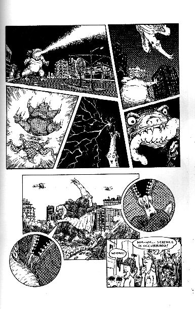
Kosmostraitor #2 Now Available! $2
Hm. He seems to have forgotten how to spell the name of his comic, or maybe he just didn’t notice. Whatever the case, the main story in here is fantastic. It’s about some giant monsters who begin fighting in a city landscape, when suddenly the zippers get loose, some giant people come out of the costumes… and they start screwing like mad. Great stuff, as it just kept getting more and more over the top. Some graphic stuff in here, so don’t buy this for a nephew or anything. The bits in the beginning and end were kind of throw-away stuff. Not particularly bad, just not that great compared to the phenomenal main story. Contact info is up there, monkeys come free with a comic…
Comments Off on McKenna, Dave – Kosmostraitor #2 | Reviews | Tagged: Dave McKenna, Kosmostraitor | Permalink
Posted by Kevin
April 24, 2010
Website

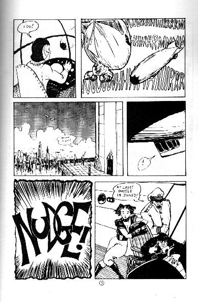
Kosmostrator #1 Now Available! $2
Here’s a pretty good random mini I picked up at SPX. Three stories in this one. The first is by far the best of the bunch, a break-neck retelling of, um, a blimp fight. Great stuff, worth the price ($2) right there. Then there’s the story of a movie shoot where a robotic dinosaur comes alive and starts killing people. Hey, I don’t know how you could possibly go wrong with a good robotic dinosaur fight. Then there’s “Secret Pornographer”, and I don’t get it. Maybe that ending will make sense to me at 3 in the morning tonight, in which case I’ll be sure to update the site again with my revised opinion, but right now it didn’t do much for me. Had to hunt down the contact info, as there was nothing in the book, but here’s an e-mail address. Check it out, it’s worth it.
Comments Off on McKenna, Dave – Kosmostrator #1 | Reviews | Tagged: Dave McKenna, Kosmostrator | Permalink
Posted by Kevin
April 24, 2010
Website
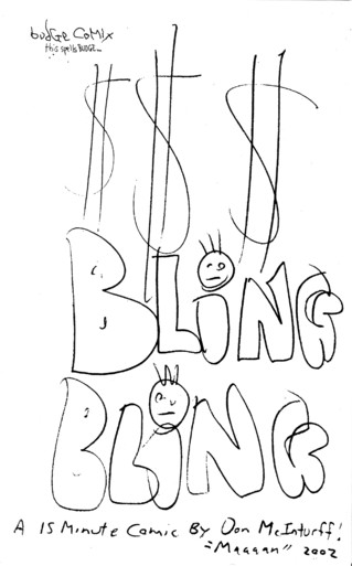
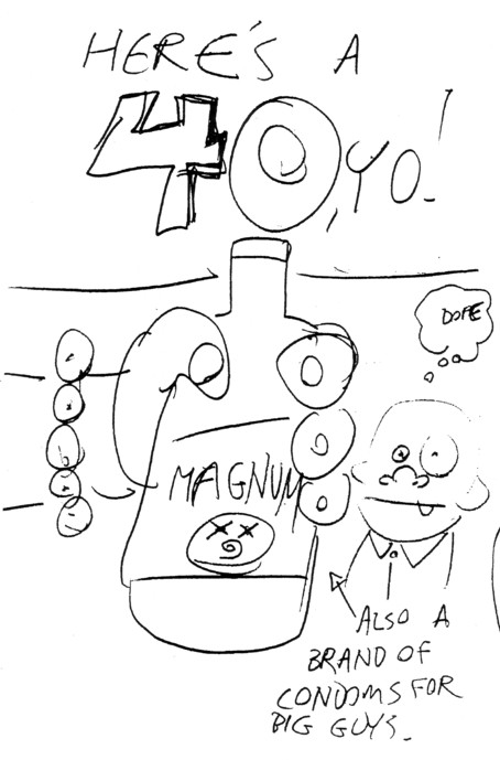
Bling Bling
Well, the conditions for liking this one are pretty simple. Are you the type of person who would find a comic about the love of bling, done in a mostly hilarious fashion, humorous, or are you the type of person who would take one look at something like this and decide that’s stupid and move on? Well, it is funny, if you like this sort of thing, anyway. Especially the reference to his “international homies”. So do you like funny things or not? The choice is yours!
Comments Off on McInturff, Don – Bling Bling | Reviews | Tagged: Bling Bling, Don McInturff | Permalink
Posted by Kevin
April 24, 2010
Website
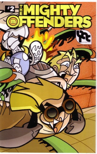
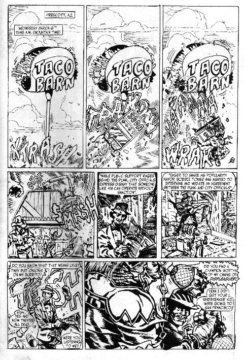
The Mighty Offenders #2 (co-written by Tod Parkhill and art by Joey Mason)
I forgot to add those other creative folks in the last review. Sorry about that, I usually try to make all of that stuff clear. Anyway, onwards to #2! I said that this series could turn out to be one of the great parodies, and I still stand by that possibility, but this issue didn’t do too much to push that along. Our heroes have been captured by aliens in regards to that stolen jet pack, and most of this issue is pure mayhem and explosions. Which is fine, but… who are these people again? Please with some sort of synopsis of the previous issues before #3, it would be ever so helpful. Also, I have a tendency to bitch when people are lazy on the backgrounds, but this comic looks like it will never have that problem. Just check out the sample if you don’t believe me. EVERY panel is packed, sometimes to the point where you really have to examine it just to make sure you’re catching everything. All in all a good issue that looked fantastic. And it’s not like most parodies have the most well-rounded characters in the world anyway, so it’s entirely possible that I’m looking for something that will never come. Still, if I didn’t have that one minor complaint about a lack of character development (or even trying to remember who the characters were) then this would be a completely positive and gushy review, and who wants that? $2

Comments Off on McInturff, Don – The Mighty Offenders #2 (with Tod Parkhill & Joey Mason) | Reviews | Tagged: Don McInturff, Joey Mason, The Mighty Offenders, Tod Parkhill | Permalink
Posted by Kevin
April 24, 2010
Website

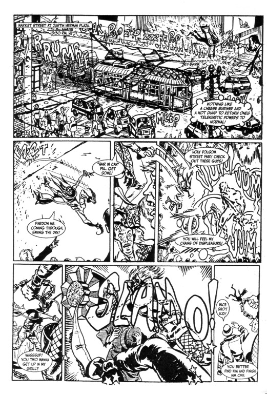
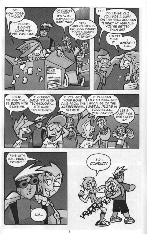
The Mighty Offenders #1
I suppose there are already plenty of superhero parodies out there, and a whole bunch of them are bad. That’s fine, those things tend to go away on their own after a few issues anyway. This one (and I’m well aware of the fact that this is only one issue and it could go downhill fast from here) has the potential to be one of the best. The team is eclectic enough, as one of the members found an alien jetpack and watch in the mail, another can “think” at animals, anther one looks like the average strongman in the group, and the rest of them don’t get much time to develop. Why not? Well, because about half of the book is this frantic, completely insane car chase that involves a flying deer. The art looks vaguely like the best whorly animators on Nickelodeon or other animated shows, which fits the frantic storyline perfectly. Oh yeah, the story. The man with the jetpack has just gotten it in the mail from aliens and doesn’t know how to work any of this technology, so he’s trying to join this superhero group. One of them pulls the cord on the jetpack, he flies off and the chase scene ensues. It’s $2, you can find it here, and it’s well worth a look. Seriously!
Comments Off on McInturff, Don – The Mighty Offenders #1 | Reviews | Tagged: Don McInturff, The Mighty Offenders | Permalink
Posted by Kevin
April 24, 2010
Website
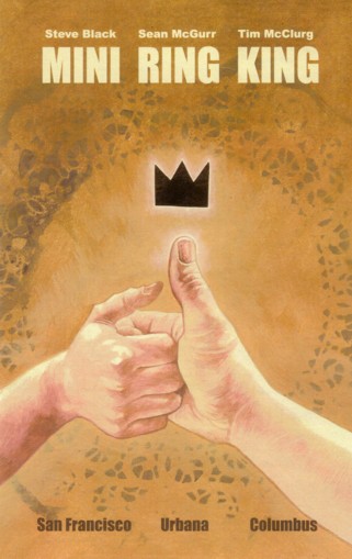
Mini Ring King (with Tim McClurg & Steve Black)
Yeah, this should probably be on one of the Various pages, but those things are too huge already and Sean was kind enough to send it to me, so he gets the honors. Just in case you were ever interested in that sort of “inside Optical Sloth” logic, and shame on you if you were. There are a few stories in here, as well as some lovely pinups of some old wrestlers by Tim McClurg. First up is a story about a soon-to-be-dead boxer, appropriately called Specter. Next is a silly story called Vowel Boxer about, well, boxers who shout vowels as they punch, which didn’t do a thing for me until the punchline, then I loved it. Finally there The Wrestler of Wyagoth, about the quest of man in general to overcome a Lovecraftian cast of monsters. Good stuff overall, worth it just for the pinups if you were a fan of wrestling back in the day, and the stories aren’t too shabby either, although the whole thing goes by in a blur. Hey, how much plot can you have with wrestling being the theme, right? $2
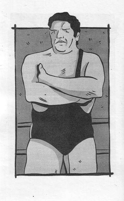
Comments Off on McGurr, Sean – Mini Ring King (with Tim McClurg & Steve Black) | Reviews | Tagged: Mini Ring King, Sean McGurr, Steve Black, Tim McClurg | Permalink
Posted by Kevin
April 24, 2010
Website
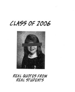
Class of 2006 #1
Hm, is something still considered a comic if there is no actual art, just quotes from students accompanied by unassociated pictures of random students? Oh well, I’ll leave that for the philosophers to figure out. Sean works as a grader for the standardized tests that students are forced to take to avoid being “left behind”, and he decided to put together a few books with some of the dumber quotes from students. It’s a fairly depressing compilation, if you think these people are the future of the country, or kind of funny if you’re a hopeless cynic like me. It’s mostly simple errors like misspellings or grammatical mistakes (look around this site for two minutes and you’re sure to find plenty of those), with some real whoppers about mistaken history. It’s a fun little peek into the brains of the youth of today. $1
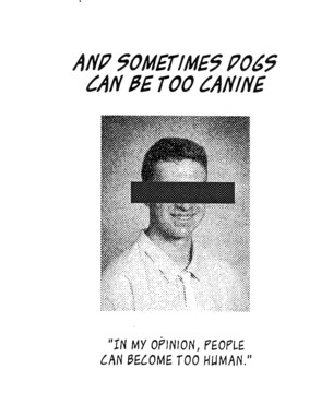
Comments Off on McGurr, Sean – Class of 2006 #1 | Reviews | Tagged: Class of 2006, Sean McGurr | Permalink
Posted by Kevin
April 24, 2010
Website
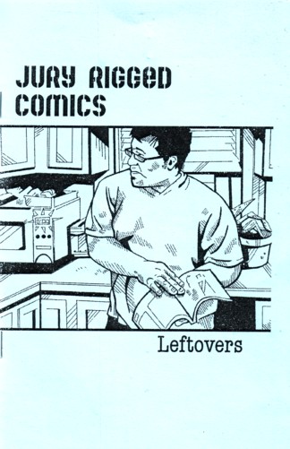
Jury Rigged Comics: Leftovers
That’s usually an instant warning sign, when somebody puts out a book of stories that weren’t good enough to put in the regular series. Luckily in this case they really are still good stories, so don’t worry your pretty little heads about it. First you have the first attempt by the Chinese to travel to the stars way back in the early 16th century (drawn by Adam Walmsley). The art is downright gorgeous and I’d never heard this story before. Then you have the near-war over bridges in Cleveland and Ohio City in 1837 (drawn by David Beyer Jr.). Fascinating stuff again, as how many of us know any of the history at all of our state and/or town? In other words, don’t be fooled into thinking this is a throwaway issue, nothing to see here and please move on. There are stories worth reading in this comic, and that’s all any of us can ask for. $2
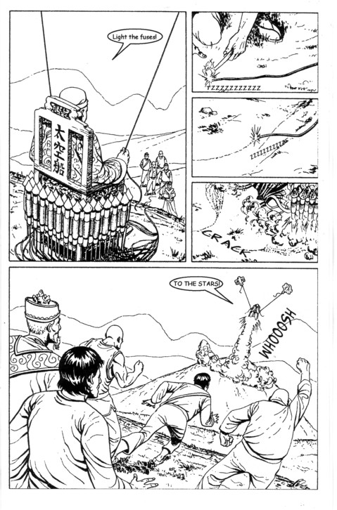
Comments Off on McGurr, Sean – Jury Rigged Comics: Leftovers | Reviews | Tagged: Adam Walmsley, David Beyer Jr., Jury Rigged Comics, Leftovers, Sean McGurr | Permalink
Posted by Kevin
April 24, 2010
Website
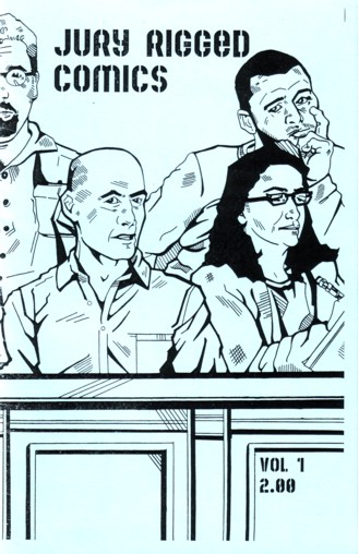
Jury Rigged Comics #1
Here’s another first effort from somebody out of Columbus, Ohio. Must be something in the water out here. Anyway, this is a collection of stories with a variety of different artists. The first one, Snow Tires (with Leon Briones), is about someone selling his car but trying to keep the snow tires when he sells it. I know, it sounds boring as can be, but it’s not a bad story. The second is As Seen on TV (with Rich Molinelli), and it tells the story of a young paramedic who gains some unwanted fame by having a rescue on the television show Rescue 911. The last full story is Mentor: What’s in a Name (also with Leon Briones), which is the story of a young superhero trying to come up with a name and learn the ropes of the business. Then there’s a tiny, tiny preview of Zero Point (I say tiny because there’s one page of art and one shrunken page of script) and an essay about his personal history with comics. For a first effort, it’s not bad. It’s good, when writing, to use “it’s” instead of “it is”, at least every once in a while, just to make it sound like people are really talking, but that’s a minor quibble. There’s nothing here to set the world on fire, but there are three solid, interesting stories, so you could do a lot worse. It’s $2, send Sean an e-mail if you’re interested.
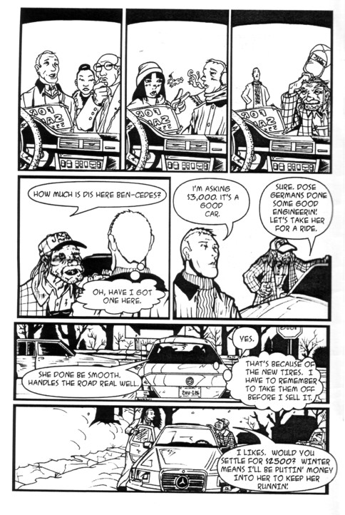
Comments Off on McGurr, Sean – Jury Rigged Comics #1 | Reviews | Tagged: Jury Rigged Comics, Leon Briones, Rich Molinelli, Sean McGurr | Permalink
Posted by Kevin
April 24, 2010
E-mail

Battles of Paradise #2
I’m going to cheat a little bit on this one: if you haven’t read the review for #1, start there. I ramble more than a little bit, but there are some possibly useful pieces of advice and criticism. Sadly, not much has improved with this issue, as there are still spelling errors all over the place and the basic construction of the comic is awful (you can see a good chunk of the comic on the right side of the cover). What’s the point on dwelling on what’s wrong with it? Granted, most things are wrong with it, but he does introduce a new character in this issue and it seems like the female lead has more than a few mysteries to reveal. The trouble is that most people aren’t going to have the patience to find those promising nuggets amidst all the crappy parts. I said before that I was hoping to see how things improved, now I have a much tougher request: I want to see a comic that is properly put together (no words or characters disappearing off the edges) and with no spelling errors (yes, that includes knowing the difference between “you’re” and “your”). It’s not too much to ask, and at least then I could get a good handle on the story and figure out exactly what’s going on here. I’m so distracted by the nonsense that I could barely even tell what was going on. Still no price, still probably a couple of bucks, and I’d still hold off until he gets his act together. I do think it’s possible, otherwise I wouldn’t be going on like this…

Comments Off on McFalls, Jerell – Battles of Paradise #2 | Reviews | Tagged: Battles of Paradise, Jerell McFalls | Permalink
Posted by Kevin
April 24, 2010
E-mail

Battles of Paradise #1
I’ll freely confess to a bit of a double standard in my reviewing policy. If somebody sends me a comic that looks terrible, has misspelled words all over the place and no discernible story, AND they’ve sent much better stuff in the past, I’ll probably tear it apart. If, however, somebody is sending me their first comic, and it has more than a few flaws, I tend to try a different approach: offering some (here’s hoping) practical advice. Jerell is 18, this appears to be his first comic, and he has a few basics to learn. I’m a big fan of everybody doing comics, and it’s clear that he has a decent imagination, so this should in no way be taken as discouragement from doing more comics. That being said, much needs to be improved here. Full disclosure: this is an anime-style comic, something I probably wouldn’t have liked anyway, just to throw that out there. The story, which would be a little difficult to tell if it wasn’t for the synopsis he thoughtfully included, is that demons are hunting after a princess for her land, and a young boy keeps popping up in time to save her. She develops an instant crush and eventually gives him some of her power so he can become a demon slayer. The trouble is that I was never able to really get into the story because of the number of basic errors contained. The sample page should give you a clue, but here are my suggestions, and this may well go for some of you people who think you have this comics thing down pat as well. First, use a spell check. I know, they don’t come installed on the comics page. If you’re not a particularly good speller, go to a place like dictionary.com and type in every word that’s more than two syllables. It sounds ridiculous, I know, but you’d be amazed at how many errors this can fix, and the more times you do it, the more you’re likely to learn. For example, “couragous” looks right if you don’t know any better, but they crammed an “e” in there towards the end. Next, keep your letters in the word bubbles/boxes. Maybe once or twice in a comic you can creep outside the lines a bit, or maybe if that’s an aesthetic choice for your comic. If it happens multiple times on every page, you need to plan your dialogue a bit better. If all else fails, write the words in first and then box them in.  You also need to know when to use “to” or “too”, “their” or “they’re”, etc. It drives me batty, and I know I’m not alone on that. You also shouldn’t need to write what’s happening in the panels, as Jerell will often use [runs] or [fall].  You have to trust in your ability to be able to show that action in the panel, as in most of the cases where he used brackets I could already see what was happening. In general, don’t be afraid to use bigger panels. There were a few battle scenes in here where everything was crammed into little panels and the brackets really were necessary. Solution: give more room for the action. I hope this doesn’t come across like I’m picking on the guy, but when you’re 18 a knowledge of the basics will take you a long way. Here’s hoping I get to see Battles of Paradise #2 to see what leaps the man has taken forward, but I’d chalk #1 up, except to the most diehard of anime fans, as a learning experience. No price listed, I’m guessing a couple of bucks.

Comments Off on McFalls, Jerell – Battles of Paradise #1 | Reviews | Tagged: Battles of Paradise, Jerell McFalls | Permalink
Posted by Kevin


